
Case converter
Case Study

Client
Case converter is a contingent of the Freeware Lovers. Freeware Lovers is a community aimed at sharing free software and open source features.
Product
Case converter is a tool that changes the letter casing of text (from lowercase to UPPERCASE or camelCase). It helps standardise formatting for programming, writing, or data entry.
Steps
-
Product research - User eval., Competitors.
-
User research - Internal surveys, personas.
-
Designs - User flows, card sorting, prototyping.
-
Feedback - Testing, iteration, repeat.
Requirements
Freeware Lovers wants to improve the layout of the site, both mobile and desktop, to better compete with growing levels of competition.
Time Allotment: 1.5 Weeks
Product research
Before I can look into a solution for the site I need to research into the target audience and user. Who is the audience? What problem is it solving? How best to solve this problem? I need to answer these before improving the experience.

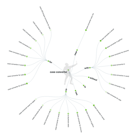

Unfortunately, Freeware Lovers do not have a mailing list of users for me to survey. I found myself looking into search trends to see how often people looked for platforms to convert cases, as well as what inbuilt writing software and popular software offer as a service in the same field.


Analysing the competition across platforms, writing software, websites and apps to see how others were dealing with the same issues. Compiling a summary of the market, feedback, reviews, strengths and weaknesses before looking at the Case Converter site and analysing it in the same way.
User research
As there was no way of contacting the user base for the Case Converter, the next step of understanding the user's needs was difficult. I found that the best approach was to go into Apple store/Android store and plugin download sites to work from reviews of similar products. From the information, I was able to recognise what case converter sites and apps are used for, the types of people who use it, and I was able to construct a persona to test the site on and see its usability.

Points on the user:
-
Mostly older users.
-
Mostly used for leaving comments or reviews on sites, adjusting text in messages or simple, on-the-go situations, that do not require large bodies of text.
-
Fixing large bodies of text are normally with in-text writing software, which have converters built in, this applies to most email platforms too.
-
The platforms need to be mobile-friendly, there are app versions, mobile friendly sites are more popular because they do not use up space on the user phone.
-
A large portion of use cases come from users on their phones, in areas that make it difficult to rewrite, therefore the platform should be easy to use with an emphasis on the end goal and a secondary goal of promoting Freeware Lovers.
Reassessing layout and features in the Case Converter I sent links to several volunteers, asking them to give me feedback on the site itself and its competitors. Overall the feedback was very positive. Most of the criticism was towards the design and colouring. When asked which of the websites the volunteers would use (of course without telling the volunteers which website I was representing) no one picked Case Converter, when asked why they chose these sites it was because of the visuals and the design.
%20Customer%20Journey%20Map.png)
Developing the feedback into a Customer Journey Map, I figured out where to improve the flow of the chart by highlighting what aspects slow users down the most.
What i found:
-
The flow of the site was straight forward. There were no issues, no dead-ends. All users successfully navigated the website, both desktop and mobile.
-
The site failed in areas of efficiency, as stated before, most users looking for a case converter are in some form of a rush or want to get it converted quickly, with this in mind, we need to maximise time to value.
-
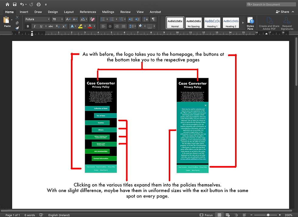
Other failings for the site included the Terms & Conditions, Privacy Policy and the Contact sections:
-
Terms & Conditions/ Privacy Policy as mentioned in the benchmark are full of information but difficult to navigate, many users found it frustrating as there was an overload of information.
-
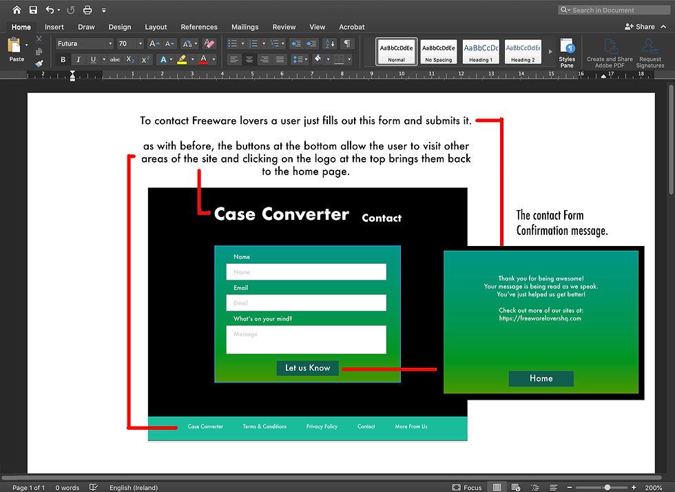
The Contacts section suffers from an equally infuriating problem in that it just contains a link to Freeware Lovers email. When users need to write an email, over submitting a form than they are more likely to abandon the interaction, limiting the feedback Case Converter receives, this issue is also stopping them from improving and expanding on its user base.
-
Designs
Finishing up the research stage and moving onto the design side, I began my work with a site map to layout the necessary screens and interactions.
%20Site%20Map%20copy.jpg)
Getting my head around assets, and screens, I began planning an eye-catching layout to match the redesigned personality of the Case Converter. Creating a style guide, with the potential colours and fonts I set about designing the high fidelity prototype in Adobe XD. Sharing iterations with the team at Freeware Lovers, getting and dealing with the feedback.


Narrowing down the style choices with the rest of my team was an interesting experiment in seeing how people of different age groups and nationalities react to an issue.
All of us reacting to the research allowed me to have a fresh perspective on the design and incorporate aspects I may have otherwise missed.
Style%20Guide.png)
Using Adobe XD to create the layout for both the mobile and the desktop I created as High Fidelity a prototype as possible. Over the space of 2 days (a day for mobile and a day for desktop), I was able to develop the plans from the style guide and research. I created the basis of an asset library, making life easier for the developers and future redesigns that might expand on the project.


With the prototypes produced and approved by the team, I pushed for some user testing, though the project did not have a budget for it I still managed to send it out to some potential users and ask them to try it out.
Not expecting a full user test, I asked simply for some feedback. All were positive, the site is easy to use and straightforward, the mobile site was also praised for its simplicity, with that in mind, it is on to the development stages of the product. Exporting in a developers mode allowed for access to assets, and the wireframes, I created for the prototypes. When the site is ready, user testing can begin, again.
Reflections
One of the major setbacks in this project was the lack of a base user group to survey or interview. People who were not necessarily potential users were asked for usability feedback, though this gave me some interesting insights. The problem of the user not having input was an issue I had to overcome through personas and onsite surveys with little results. The design was a contentious issue as I pushed for the mobile version to be a key in the market, the idea of keeping it small and easy to load and processes like auto copying the text upon conversion. I realised, to gain users, the site must be as quick and easy to use as possible.


