
Dashboard creation
Case Study

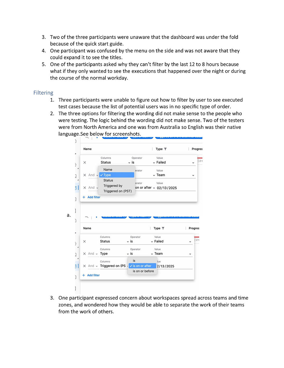
Client
Tricentis offers automated software testing tools to ensure app. quality and support continuous testing. Their AI-driven platform integrates with DevOps workflows to accelerate release cycles.
Product
Tosca cloud is the online offering for module based automation testing. It will be linked to the on-premise product but offer a number of new and interesting features.
Steps
-
PRD - Previous versions, workshop.
-
Designs - User flows, Mid fi designs.
-
Feedback - Interviews, design review Iterations.
-
Handoff - Feasibility, Implementation.
Requirements
With more and more customers signing up, the importance of a dashboard increases. Tracking the progress and data being produced by the test runs and the testers working in a workspace.
Time Allotment: 4 Weeks (part time)
Product request document
As the product matures, our process does with it. The importance of structure and organisation deepens.
We need to be able to track our decisions, why we made them and the conclusions that we came to with them.
This is something documented across the UX process through research documents, feedback documents and hand off files.
But to make sure all of this starts on the right leg, a product request document was written up by the product manager, developer manager, product architect and myself from the UX team.
Once this had been approved and run through the right hands we were ready to start.
This came first by looking over the 4 other instances where Tricentis has looked into dashboarding solutions in other products. I studied specifically what they had worked on, focused on and where they had failed. As the designer who worked on some previous versions I already had a wealth of knowledge on the topic.
I was also adamant that this time would succeed.


Having gone through the previous attempts, particularly my own notes on what could have and should have been done differently.
As far as I was concerned, the biggest issue we had repeated was trying to do too much too soon and biting off more than we could chew. This often lead to compromise and deviations landing us with a solution that barely resembled our intent. This time with a PRD written we had a track to stay on.
Once the research was complete, the notes had been reviewed and the lessons learned, I began mapping out a workshop, attended by the same writers of the PRD with addition of the implementation team. We kept the workshop as simple and straight forward as possible, an open discussion on priority.
We already had a list of what the users want to see, straight from the users themselves.
Our workshop would be on the prioritisation of the information, more of a discussion on what should come first instread of deciding if at all.


Design

The workshop was intense with a lot of strong opinions.
The biggest point of contention came between the importance of the charts vs. the visual striking elements of it. Having discussed it amongst us there was an understanding that the users needs were first priority but that there is an importance of showing the strength and potential to come.
With version 2 being more important to the user but less visually interesting.
Although I was actually against adding just for visuals, I understood the need and benefits.
We came to a conclusion agreeing on 2 simple charts for version one and expanding to 5 by version 2.
The order of the charts was decided by UX after. Along with a map of interactions and a general style based on the chart gallery already being put to use in the product and other products in the Tricentis library.

With the notes gathered, research done, style decided. Mockups were began. Once the preliminary work is complete the design work falls into place. By now we are working with an established design library of components so throwing together a medium fidelity design, run it through the design team for feedback before beginnning rounds of testing with an external userbase.
Feedback


The user feedback showed us that there were still some draw backs and issues we needed to address.
Some of it was predicted, all of the users questioned the importance of some of the charts. They were confused why we were prioritising the creation rates of test cases and playlists, for most users this number is pointless.
Beyond this the biggest issue to be solved was the issue with interactivity. Those tested also failed to recognise the interactivity of the charts themselves. Though it is clear you can filter the charts down by interacting with them, it is not so clear that clicking through can bring users into a filtered library of the required assets.
In the original designed version of the Run results section, we also included a data grid underneath that would show the filtered results, time based, result type, and in form the user can filter this data grid to affect the results being displayed in the chart.
However, due to time and scope limits, this had to be restricted back to just the chart and it linking to the results page with the filtered down results.
This is a worthy solution for the user but it limits clarity of interaction. Making it less apparent what or if a user needs to interact.
And since our success rate will be measured by interaction percentage, having an unclear level of interaction is unwise and even if it is important or used by our clients, it could still be measured as a failure.
The feedback was factored and adjusted to best we could figure. If there were more time we would be trying a few more tests but our approach needed to change. Implement with the current feedback and then test when released gethering feedback from that point on.
So an ongoing feedback list would need to be setup.


What's Next?
As we finished the version 2 of implementation, the first thing we had was a team meeting with the developers. We sat down to have a UX/UI review of the implementation in the prod environment. Ahead of the meeting I studied the implementation, tracking the differences and discrepencies.
Running through the list with the team we discussed what was an essential fix and what we could overlook for now and improve with future implementations.
Once this was done we primed the dashboards for beta testing with a limited release.

Giving the dashboards a 2 - 3 month beta period allowed us to gather initial user feedback over what our clients thought, expected and wanted for the future.
As this information came in we ranked it by priority and scale of change and created a feedback table.
This ensures that should a new designer be assigned the maintenance and further development of the dashboards than it will be even easier to hand off and track.
Factoring in the data tracked it is very easy for any designer to take over.


Reflections
After seeing and working on dashboards in Tricentis 4 times previously, I was clear on how to make it work this time. I pushed for the elements I knew were important and pushed the team to get it done. The combined work of the product manager, lead developer and myself made sure that this time there is already a 10% adoption of the dashboard features as of the beta release and that the new more complex feedback is starting to arrive. Not to mention requests for more input.
What I would do differently?
There are only small things. The biggest of which being I would have pushed for an alternative to the creation rates section. Users regularly question the importance of it.
On top of this figuring a success metric for a dashboard is proving quite tricky. Not only this, but for newer users, a dashboard holds no values until a review process is introduced, meaning successful test creation, test execution and debugging to truly benefit from one.
As part of the PRD we should have realised this and factored it into our planning.